Affordances, Gestalt Laws and Dark Patterns
A short introduction, with original examples, to three design concepts applicable to Human-Computer Interaction.
With a name as elaborate as "Human-Computer Interaction," someone hearing it for the first time might well think it's about sci-fi or futurology. The concept, however, is quite straightforward: HCI is the study of how humans interact with computers. Yeah, I said it was straightforward… But that doesn't change the fact that the field still encompasses systems like Iron Man's J.A.R.V.I.S. After all, Tony Stark is a human, and his armor is a computer, right? Although we're moving toward a reality in which everyone will also have their own personal AI (think of Meta's new Muse) in the not-too-distant future—well, I'm doing a master's just in Virtual and Augmented Reality—the important thing, when it comes to HCI, is to keep our feet on the ground, because what we're going for is intuitiveness.
One example of a company that did this job well was Apple—always Apple, when it comes to design—when it launched the first iPhone, or even earlier, with the Macintosh. Back then, personal and portable computers weren't common, so people didn't yet know how to use them. That's why Apple adopted skeuomorphism, another big word with a simple idea: making digital or modern objects mimic the appearance or functionality of their original versions, simply to make them more familiar and easier (more intuitive!) to use, even if this doesn't offer any other benefits (or even leads to "drawbacks" in some cases). For example, "slide to unlock" mimics a door latch; the clicking sound and the screen's flash when taking a photo mimic the shutter of an analog camera closing; and the trash can, folder, and notepad icons mimic those same objects in the real world, though they didn't need these analogies to perform their functions. In any case, even though all of this is "unnecessary" from a purely pragmatic standpoint, this approach was absolutely necessary to popularize the first computers among humans a few years ago.
The first rule of HCI is:
"A good interface is no interface."
In other words, people ideally shouldn't have to think about how to use an interface. They should interact with it naturally, preferably without even noticing it. So, let's look at three design concepts that help us think about this rule: Affordances, Gestalt Laws, and Dark Patterns.
Affordances
The term affordances comes from the English verb "to afford," meaning "to have the means," "to offer," or "to provide." It describes an object's ability to show, on its own, how you should interact with it, without any explicit explanation. In other words, it's almost a measure of intuitiveness: how easy is it to use something without needing an instruction manual?
I've already given an example of good affordances here: Apple's early software designs, shown in the illustration below:
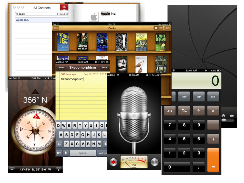
These apps have good affordances because they replicate how things work in the real world, making them intuitive to use in the digital world, even if, back then, that world was completely new. Nowadays, the design of those same features is much more minimalist. That rarely bothers anyone, though, because we got used to the gradual changes and now know how to use a modern phone instinctively. Many older people, however, have difficulties they probably wouldn't have had with iOS 1, for example. That has to do with how the very concept of affordances has changed. It was originally defined as a real, objective property of an object, independent of who interacts with it. But clearly, each person's cultural, social, and psychological context gives that property a subjective quality too.
European windows, on the other hand, are an example of a bad affordance. Any Brazilian who's been to Europe and tried to open a window knows exactly what I mean:

It goes something like this: first, you notice they have a handle—yes, like on a door!—, but you can't pull or push it. Then you figure it must be locked, and that can only have something to do with the handle! So you turn it, and it works. You learn pretty quickly: down locks it, sideways unlocks it. So far, so good… The problem is that you can't help noticing that the handle didn't turn all the way. It can still go farther: up! Why would it turn up??? Out of sheer, genuine curiosity, which is part of human nature, you put yourself in the unfortunate position of finding out what this third setting does. You could never see it coming: the window catches you off guard! It opens only at the top, tilting inward, and for a moment you're sure it's going to fall on you, which you instinctively and embarrassingly still try to catch… Or worse: another, even more treacherous model, which, believe it or not, tilts outward! In that situation, for one long millisecond, you think you're about to kill someone because suddenly the window is falling out of the building!
Since my professor wants me to suggest a design improvement for this bad affordance, I think European windows could simply work like the Brazilian ones (sliding or push-out, without articulated handles), or use a bolt to unlock them instead of a handle that turns sideways. That way, unsuspecting people like me wouldn't even think to turn the handle up, sparing us that terrible first experience…
Gestalt Laws
You may be wondering: why "Gestalt Laws" and not "Gestalt's Laws"? Well, Gestalt isn't a German psychoanalyst or anything like that. It's actually a school of psychology from the early twentieth century. In short, Gestalt theory says our brain is lazy—in a good way. Everything in evolution is about balancing energy intake and expenditure, and the brain is great at saving energy—it's no coincidence that we use only 20 watts to think, while an AI uses millions to "think." So instead of processing every little detail around us, our brain is constantly looking for patterns, grouping visual elements to make sense of the bigger picture. The rule is: "the whole is different from the sum of its parts." It's the philosophical maxim behind emergent phenomena: complex properties that arise from simple interactions among individual components, and those properties can't be found or predicted by examining the parts in isolation. The human brain itself is an example of emergent phenomena: consciousness and thoughts emerge from interactions among individual neurons, none of which are conscious or capable of thought.
There are several Gestalt "laws" (Proximity, Similarity, Continuity…), but the one that matters most for my next example is Figure and Ground: your brain has to tell what belongs in the foreground (the figure) and what is just the background. If that distinction isn't clear, you get confused. And guess who's been using this Gestalt law masterfully lately? Apple, again. It used skeuomorphism to teach people how to use a smartphone; now it wants to get us ready for the new technologies on the way. Look at the iOS redesign and you'll see an invasion of Liquid Glass everywhere—or Glassmorphism, if you want to sound fancy. It's an aesthetic full of transparency, blur, and layers that imitate glass behaving like a liquid—I know, these concept names are so straightforward… At its core, it's a modern, polished version of what Windows Vista did with its Aero theme back in 2007 (which you thought was the coolest thing ever at the time). But Apple didn't adopt the "liquid glass" look just because it's pretty and minimalist. The real goal is to start training our brains now for Virtual and Augmented Reality interfaces (like Vision Pro and future smart glasses) that we'll probably all use.
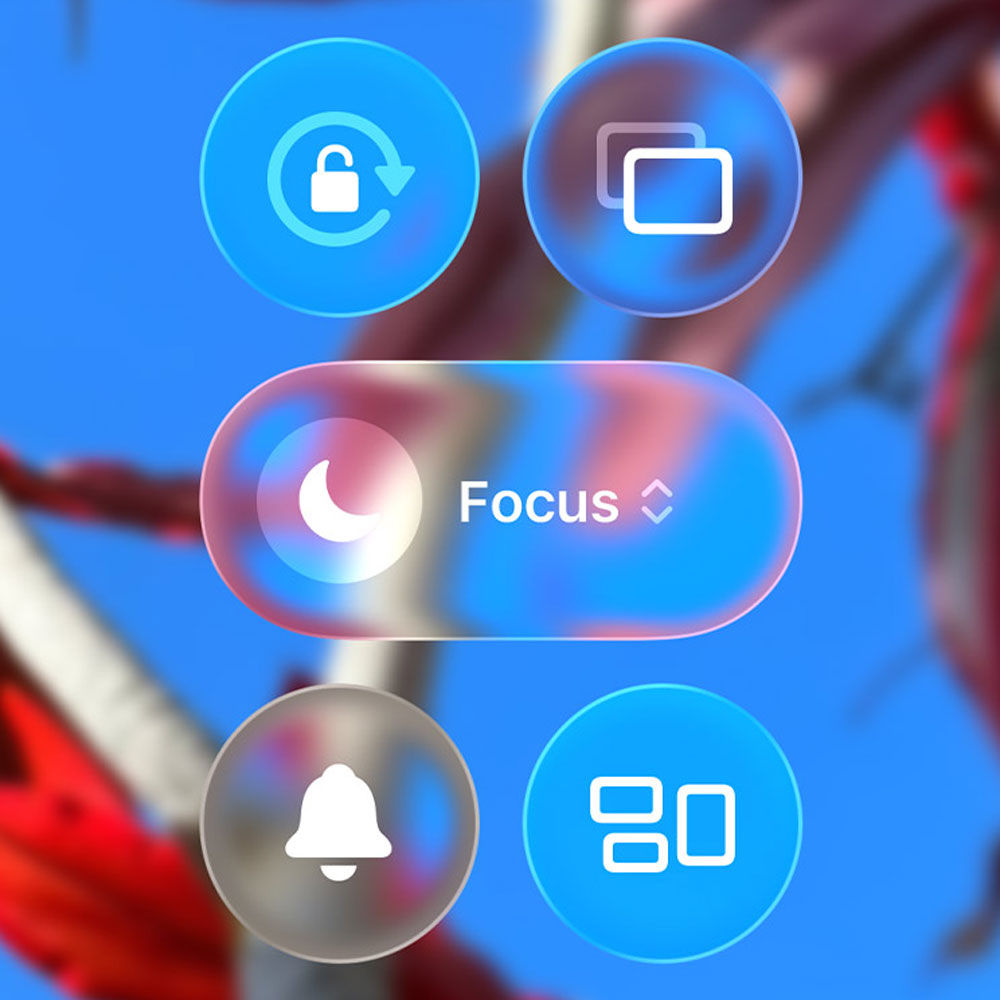
Think about it: how does the Figure and Ground law work on your phone today? The pop-up notification that appears is the figure; the screen behind it is the ground. Easy. But what happens when the screen is… the real world? Imagine you are walking down the street wearing your AR glasses and get a message. If the interface is an opaque, flat rectangle that literally jumps in your face, you lose your peripheral vision, cannot see the sidewalk, and trip. To be less alarmist, the main problem is that the visual clutter would be overwhelming and the interface would become unpleasant. But when a Liquid Glass pop-up appears floating in front of you, it simply blurs the real world behind it. Your brain, using the Figure and Ground law, instantly understands the hierarchy, you know where you are, and your vision does not become cluttered. You get the information from the interface without losing the context of the physical world.
Apple is giving us a lesson in continuous design: they take concepts from visual psychology and turn them into a pretty little "glass" effect on your phone today, just so that five years from now, when the interface jumps in front of your eyes, it will feel like the most natural thing in the world. After all, as we saw in HCI's golden rule: a good interface is no interface. They are basically creating the original object themselves so they can later apply skeuomorphism to it.
Now, an example of a bad use of the Gestalt Laws, as requested by my professor, is my master's program website's own class schedule:

Checking what the next class will be should be a quick and intuitive task. However, some laws were ignored (or applied backwards), producing the opposite of the desired effect:
1. Law of Proximity - says that elements close to one another tend to be perceived as a group. In a weekly calendar, the least you would expect is for the shifts on the same day to seem like they belong to that day. In this calendar's header, we have the days of the week and the shifts. However, the vertical line separating one day's "PM" from the next day's "AM" is visually identical to the line separating the "AM" from the "PM" within the same day. Since the spacing is continuous and uniform, the brain does not group the shifts by day of the week. Instead of seeing "5 days with 2 blocks each," you see 10 generic, independent columns on the screen. Perhaps the AM and PM shifts should be arranged vertically, or separated by some spacing between different days. Also, since the days are not numbered one by one, the reader is forced to count to figure out which day of the month corresponds to which day of the week.
2. Law of Similarity - says that our brain groups things that look alike (same color, same shape, same font). The designer here tried to use this, but created visual clutter that is hard to decipher. It might have been better to use the full names of the courses and professors instead of abbreviations. If there was not enough space, simply using the professor's first name (like "Mohamed" instead of "MD") or something more representative ("Coll. Env." instead of "CE") would already help a lot. Color-coding was a good idea to try to take advantage of the Law of Similarity, but, as a wise uncle of mine would say:
"The road to hell is paved with good intentions."
We will see in the next law how this ended up being harmful.
3. Law of Common Region and Law of Continuity - the first says that elements within a defined boundary (such as a block with the same background color) are perceived as a single entity, and the second says that our eyes tend to follow fluid directions, like straight lines. Look at what happens starting in Week 38. The designer decided to group entire weeks, creating huge vertical blocks (like the long green rectangle crossing Tuesday afternoons and Thursday mornings, or the lilac block on Monday afternoons). The problem is structural: a school calendar is experienced in time, that is, horizontally (you move through Week 38, from Monday to Friday, from left to right). But the vertical common regions force your vision from top to bottom. When you try to read the rows horizontally, your eye hits a visual "wall" of vertical colors and gets lost. The design is literally fighting against the direction time moves in.
Author's note
The design is so anticognitive that the LLM I used to proofread this text got lost in the columns and colors, read the wrong days, and tried to correct me. If the machine built to find patterns failed to find them, imagine how unpleasant this is for the human brain, which is eager for lazily easy patterns.
Dark Patterns
Finally, a concept with a more creative, less straightforward name! In design, Dark Patterns are tricks built into an interface to mislead you, make something you want to do harder, or trap you in a loop. They put the company's interests first, ignoring and even sabotaging the user's well-being. You know how, when you try to cancel a subscription, the "keep my plan" button is huge and bright, while "cancel" is tiny gray text hidden in the footer? That's a classic dark pattern. But the example I hate most—at least among the ones I've noticed—is much more complex than a gray button.
As the tech world's maxim goes:
"If you are not paying for a product, you are the product."
That's why social networks use and abuse behavioral dark patterns to keep you hooked. And the biggest culprit right now is short-video algorithms, which lead to the infamous "doomscrolling":
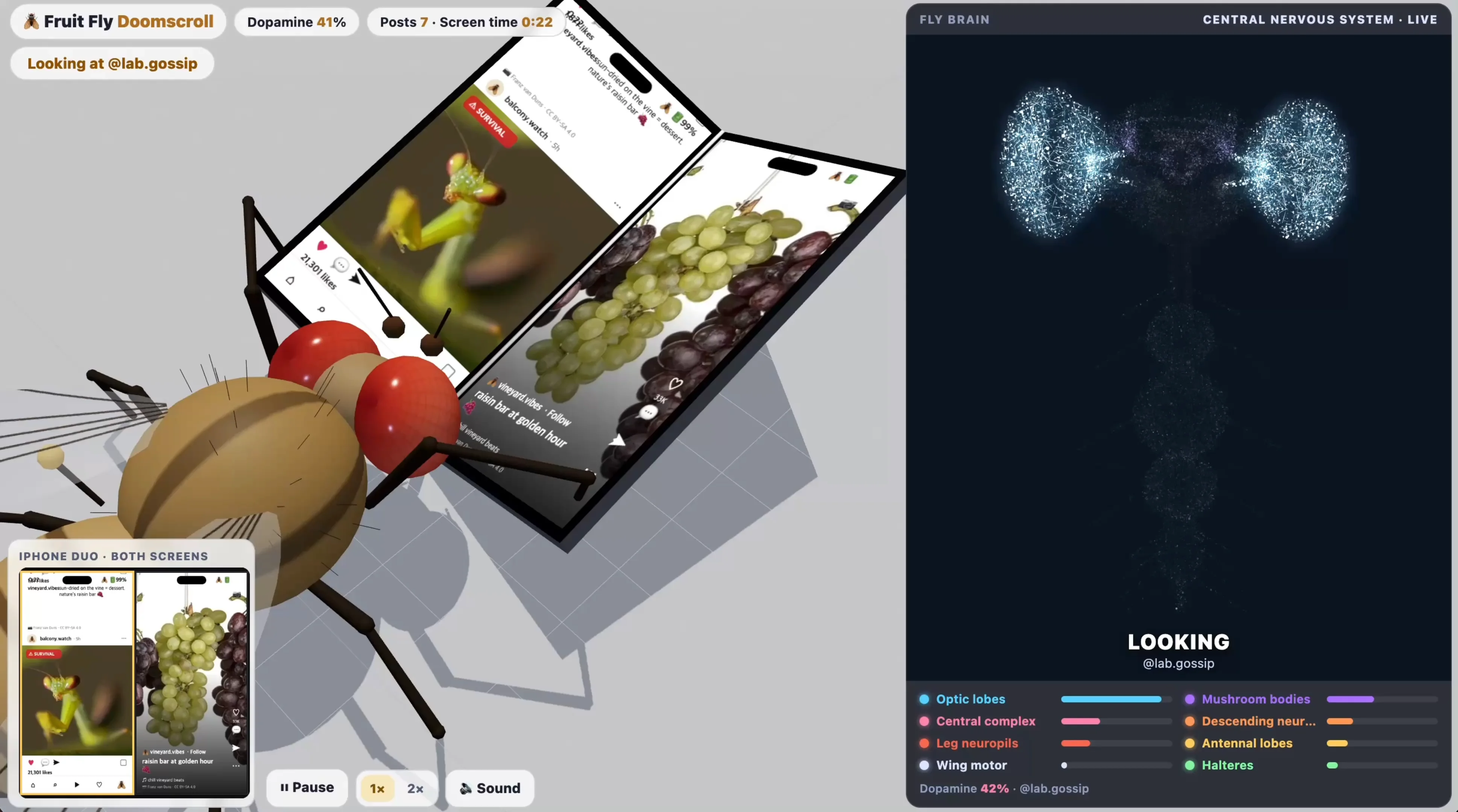
The infinite-scrolling feed, where the screen never ends and the next video starts loading before the current one has even finished (try going offline while watching Instagram Reels; you will see your video freeze, but the first few seconds of the next five are already loaded), is meticulously designed to remove any friction that might make you stop and close the app. The more time you spend scrolling, the more data they extract to sell to other companies, the more they can manipulate your thinking in their own interests, and the more ads they can show you. The days when social networks were about connecting with friends are over. Rest in peace, Orkut—every Brazilian who used the internet in the 2000s knows exactly what I am talking about and how much we miss real communities. Today, the internet is about controlling what users consume and retaining their screen time.
My survival tactic has been radical: I do not have any apps containing short videos installed on my phone. I have never even created a TikTok account, because I know that:
"If you gaze long into the abyss, the abyss gazes back into you."
But the dependency is real, so I still access Instagram and YouTube, just with strict rules. I do not use just any browser on my phone; I use Firefox. It lets me download plug-ins to block specific URLs (that way I use Instagram without access to the Reels tab and YouTube without the Shorts page) and hide sponsored or suggested posts. With this trick, I only see what the people I actually follow are posting, and my feed has an end. And do you know what is most frightening? Even with short and suggested videos blocked, I still spend more time than I should on these platforms, which only proves how incredibly effective and insidious the dark pattern is.
Fortunately, the real and definitive solution is on its way: Orkut announced it is coming back! The problem is that there is still no announced date… So, until we have a real social network again, our only temporary solution is to use these workarounds or isolate ourselves in the mountains like monks.